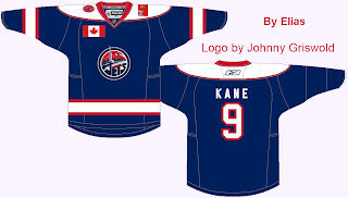
For the special post, I will be posting a bunch of my older concepts, before I started this website. Please feel free to make fun of me in the comments section! Thanks to my few followers for 1000 views! These jerseys are in no sort of timeline.
 |
| This was for a Millionaires redesign at HJC. It was the first time I used the full body template. |
 |
| The first time I tried to make my own team.. eww is all I have to say. |
 |
| This was not bad for my first concept. Except for the fact that I forgot the striping and logos on the back of the jersey... Rookie mistake. |
 |
| Entry for the DHL contest at HJC. It's for the Toronto Blueshirts. It's a bit too plain. |
 |
| This was one of my most creative jerseys back then, but I just can't stand the template that I used. |
 |
| I like this one, except for the big hem. Again, one of my better ones before the website. |
 |
| This one is just really plain, and the arm stripe is curved weirdly. |
 |
| I like this one, but the gradient looks weird, because I did it wrong. |
 |
| This was an interesting idea.. but it seems really bright. |
 |
| I actually really like this one. It was for a HJC St. Louis Blues redesign competition. I think I got top 5. |
 |
| Again, I want to throw up whenever I look at this template, but I think the jerseys are alright. I especially like the alternate. |
 |
| I took the Oilers jerseys and switched the striping. I don't like the colored in hem. I do like that I put the Rexall logo on the jersey. |
 |
| And I saved the worst for last... I shiver whenever I look at this. It was a decent idea, but the execution was horrible. |

No comments:
Post a Comment